Bias Bars
Juliette Woodrow (jwoodrow@stanford.edu), Kathleen Creel (kcreel@stanford.edu), and Nick Bowman (nbowman@cs.stanford.edu)
Overview
In this assignment, students parse and store a complex dataset of college professor reviews. They use this structured data to build an interactive graphical tool that plots word frequency data across review quality and professor gender to reveal interesting trends about biases in language usage. In the process, students will practice working with dictionaries, string parsing, nested data structures, normalization algorithms, and graphical programming. Our hope is that students are able to use this exercise in data visualization and data analysis to think critically about the biases that exist in online datasets. The end product of the assignment is a complete tool that can be used to dig deep into the provided dataset while considering its social and ethical implications. It is part of the Embedded Ethics curriculum, which integrates skills and habits of ethical analysis throughout the Computer Science curriculum.
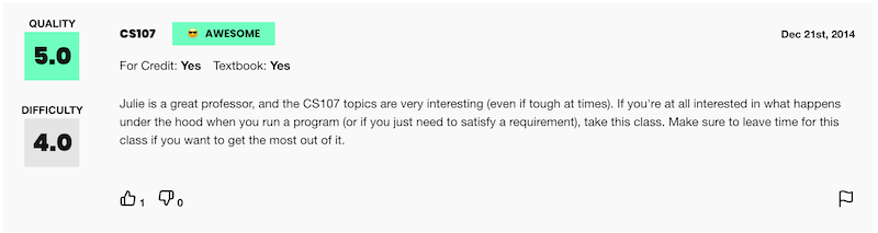
At the heart of this assignment is a dataset collected from the popular website RateMyProfessors.com, where university students can publish anonymous textual reviews of their professors along with numerical ratings. While this website contains an incredibly rich collection of data, we chose to focus on reviews from a subset of universities across a time span of 20 years, totaling about 15,000 reviews overall. Teacher ratings are a common and impactful facet of life in university. Students use the results of these reviews to help them choose their classes and plan their academic futures. However, teaching evaluations are not an objective evaluation of the quality of a professor's teaching. Recent research has shown that teaching evaluations often demonstrate harmful biases, including gender bias. The bias in teaching evaluations is a problem because the scores are often used in decisions about who to hire, fire, tenure, and promote. The goal of this assignment is to enable students to build a piece of software that helps them investigate and reason about how humans use language in gendered (and potentially biased) ways.
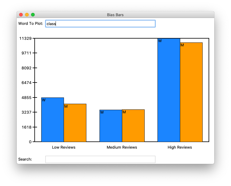
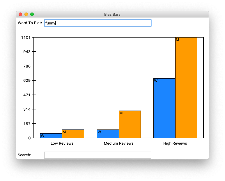
Students begin with a file of textual review data collected from RateMyProfessors.com consisting in three pieces of information: the review text, the gender of the professor being reviewed, and the numerical rating (between 1 and 5) that the reviewer assigned. In the first part of the assignment, students apply textual processing to this data file to build a nested dictionary of normalized word count frequency data organized by overall score and professor gender. In the second part of the assignment, students develop a data visualization tool that allows users to search the database of all words in the dataset of reviews and see the breakdown of word frequencies by numerical rating and professor gender. Finally, by comparing trends in the plots of different words in the dataset, students are able to identify sets of words that may be used in gender-biased ways when evaluating professors.
We have created two versions of this assignment that differ only in the "front-end" graphical library that students use to create their word frequency data plots. One version has students draw out all aspects of the GUI using a fundamental drawing library (tkinter), while the other version has students take advantage of a common data plotting library (matplotlib). We provide starter code and handouts for both versions, but do not distinguish them further in the rest of this summary, as they operate on the same core principles. A brief summary of the pros and cons of the two different provided versions can be found later on in this document.
Here is the actual assignment handout for and the associated starter code for the tkinter-backed version of the assignment and here is the actual assignment handout for and the associated starter code for the matplotlib-backed version of the assignment.
Meta Information
| Summary | The Bias Bars assignment lets students implement an interactive data plotting program that allows them to investigate bias in word usage in evaluations of college professors. |
| Topics | Data processing, parsing, dictionaries, nested data structures, data visualization, graphics, ethics |
| Audience | CS1 (capstone, end of term) |
| Difficulty | Moderate, with students taking on average about ten to fifteen hours to complete the assignment. |
| Strengths | The assignment is unusual in tying ethical analysis of a real world dataset into technical content standard to a CS1 class. Many students expressed excitement about working on a "real-world" problem with "real" data. As it is the final assignment in CS1, many students appreciated that it helped them practice many of the concepts and skills learned so far in class and found the final product "satisfying." The open-ended nature of the reflective questions allowed them to deepen their engagement with the social and ethical material presented. Finally, the end product is something students can explore with indefinitely and share with their friends and family as a representation of their growth and learning in their very first computer science class. |
| Weaknesses | There are a few weaknesses to this assignment. Firstly, the assignment handout is quite long and the code itself has a number of different components that students must complete in order to get a working product, which makes the assignment border on the edge of being too time-consuming for the scope of some classes. Secondly, the dataset we analyze is limited in size due to our ability to source/scrape reviews from the RateMyProfessors.com website. Expanding the size of the dataset to analyze could be a good way to improve this assignment in the future. Thirdly, we received feedback from students that some of the graphical programming in the tkinter-based version of the assignment could get tedious, as students were responsible for manually drawing/placing all components of the visualization. This is improved in the matplotlib-based version as students are able to take advantage of the pre-packaged plotting capabilities and avoid some of the manual drawing components. |
| Dependencies | An understanding of string processing, data structures (lists and dictionaries) and graphical programming (or plotting). Our version is implemented in Python, so specific technologies for graphical programming that students are expected to be familiar with are tkinter and/or matplotlib. |
| Variants | Students can try and come up with their own datasets to analyze and plot using the same technical framework that we present in our assignment. In fact, students are encouraged to do guided extensions where they explore datasets ranging from the age of US Congresspeople to the magnitudes of earthquakes for a given time range to the text of Shakespeare's complete works. Assignment difficulty can also be varied by adjusting the amount of starter code provided to students or by increasing/reducing the amount of conceptual scaffolding provided in the assignment handout. |
Feedback
Some sample positive feedback, shamelessly taken from our post-assignment student survey:- "I really liked how this assignment let me practice many of the concepts and skills that we've learned so far in class. What was even better was that they were used to solve a real-world problem."
- "I felt that the skillset from this assignment could really be useful with data analysis in the future, especially if I do eventually decide to major in something in the social sciences."
- "I liked that we were able to create code that seemed to be pretty applicable in the real world. The assignment seemed to be broken down into pretty manageable milestones."
- "I like how well guided it was, and that there was a lot of care put into addressing the assumption of gender binary and the ethics portion in general."
Improvements
We can imagine many possible extensions to this assignment. Porting the assignment to matplotlib allowed the students to build a powerful visualization quickly, and we are interested in additional ways to explore the same concepts while avoiding the monotony of manual GUI building. Additionally, the text of the assignment handout could be pared down to provide the same level of scaffolding and context with less text. Similar visualizations of other biased data would be another direction for extension. If you have ideas for how to improve this assignment, we would love to hear from you.
Contact
If you have any question, ideas, improvements, or interesting stories, we would love to hear from you! We are also happy to share assignment solutions, grading rubrics and autograders, and/or help you deploy your own version with a different language or scope. You can reach us at jwoodrow@stanford.edu, kcreel@stanford.edu, and nbowman@cs.stanford.edu.
Acknowledgements
The inspiration for the assignment comes from Professor Ben Schmidt's "Gendered Language in Teaching Reviews" applet. The original BiasBars assignment that was used as the foundation for our work was created by Colin Kincaid, Jenny Yang, and Monica Anuforo. We would also like to acknowledge support and valuable feedback from Professors Mehran Sahami, Chris Piech, and Nick Parlante. The style and formatting for this webpage were borrowed from Ali Malik's submission to the 2018 Nifty Assignment session.