Color My World
Naval Postgraduate School
carl.albing@nps.edu
Background
High Performance Computing (HPC) generates huge amount of data. An important part of HPC, or any field working with "Big Data", is the visualization of results. One of the easiest ways to comprehend large quantities of data is with pictures. (“One picture is worth a thousand words” seems to be really rather an understatement.)
A large collection of numbers may be the most accurate result from some HPC calculations, but it can be hard to understand what those numbers are telling you without seeing a picture. Often those pictures don't have an actual physical visibility; (e.g., what "color" are microwaves?) rather we color the display based on the numeric values using a pseudo-coloring. You likely have seen such pseudo-colorings in radar and satellite weather data:
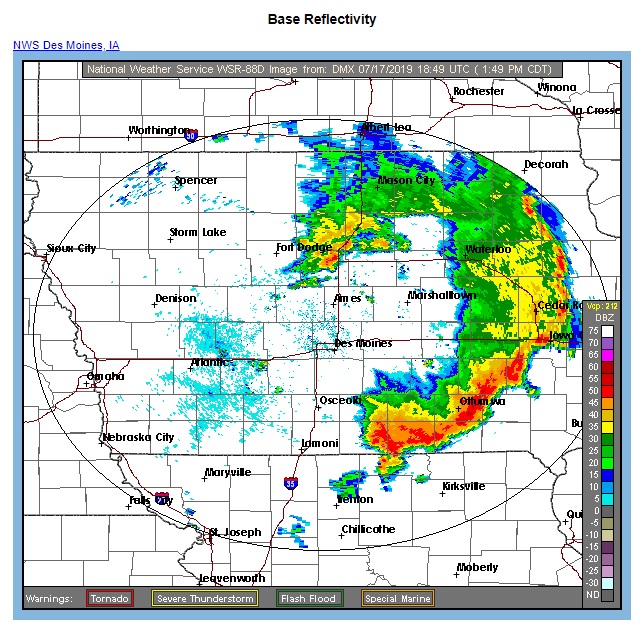
|
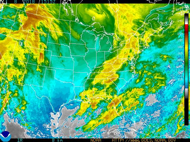
|
|
The NOAA website (http://www.goes.noaa.gov/ECIR4.html) tells us: Meteorologists use color enhanced imagery as an aid in satellite interpretation. The colors enable them to easily and quickly see features which are of special interest. Usually they look for high clouds or areas with a large amount of water vapor. In an infrared (IR) image cold clouds are high clouds, so the colors typically highlight the colder regions. The bar on the right side of the image indicates the pixel brightness values for the corresponding color. The intensity value represents emitted infrared radiation. | |
Overview - A Mystery
Given a data file of numbers - how can you see what it describes? How can you visualize it? If you convert it to an image, what does it look like? Students are given a data file, but no description about what it represents. Can they solve the mystery by generating a reasonable image? (Hint: it is not a radar image.)
The numbers need to be converted to R/G/B pixel values to make an image. But which values get which colors? It's up to the student to decide, but the goal is to tease as much detail out of the numbers as possible, by means of a custom color map.
Why are we doing this?
- First, as an exercise in visualization, to demonstrate the concept of pseudo-coloring.
- Second, to understand how artificial, though important, the coloring is.
- Furthermore, this is also a handy tool that may be useful in future labs when we generate data that we will want to visualize.
Note: This submission doesn't inclde a sample solution - neither the code nor a rendered image. Why? They are kept secret to preserve the mystery of the image. If/when presented at SIGCSE, the "solved" image will be shown but not supplied (unless you insist). (Why? To avoid an Internet search for solutions.)
Metadata
| Summary | Students develop a program to map raw data files into a colorful images. |
| Topics | visualization, big data, image processing - color maps. |
| Audience |
Use as an early assignment in an HPC class,
Scientific Programming class,
Data Science/Analysis class, or
a Graphics/Image processing class.
Appropriate for CS1 or higher students familar with loops, file io, argument parsing, and image processing. The starter code is written in Python. |
| Difficulty | This assignment is appropriate for various levels, depending on the initial conditions: starter code (or not), existing color maps (or not) and time alloted. A late-semester CS1 class given the starter code and a week. |
| Strengths |
|
| Weaknesses |
|
| Dependencies |
|
| Variants |
|
Files Included
| art/ | illustrations used in lab assignment and web page | code/ | contains starter code | css/ | style sheets for index.html | data/ | 5 different Mystery data files | GradingRubric.txt | grading rubric, sort of | index.html | web page describing this Nifty Assignment | Lab_ColorMyWorld.docx | lab assignment, MSWord source | Lab_ColorMyWorld.odt | lab assignment, LibreOffice source | Lab_ColorMyWorld.pdf | lab assignment, as a pdf | MysteryData.zip | zip file of the 5 Mystery data files | README.txt | this info, in a file |
Mystery Data Files
| rows | cols | Filename |
|---|---|---|
| 500 | 500 | Mystery1.data |
| 500 | 500 | Mystery2.data |
| 500 | 500 | Mystery3.data |
| 762 | 602 | Mystery4.data |
| 1472 | 1156 | Mystery5.data |
For an extensive presentation on Scientific Visualization I recommend "Overview and Introduction to Scientific Visualization" from the Texas Advanced Computing Center at The University of Texas at Austin